
2025 AI in Business Intelligence Software Report - A Comparison Written By A Human
We take an in-depth look at PowerBI, Looker, Tableau, and HyperArc's AI capabilities.

Introduction
Business Intelligence (BI) has evolved dramatically over the past few decades. From static reports and dashboards to the dynamic, AI-powered tools we see today, the journey has been one of constant innovation. Every company seems to leverage some LLMs to write code (and numerous corresponding benchmarks exist). Yet, there hasn’t been a significant breakthrough in BI. Experienced buyers know that generating SQL/Python only scratches the surface - the experience of enabling discovery for a business extends far beyond Natural Language Query to SQL benchmarks.
In this blog, we’ll compare three major BI platforms—Looker, Power BI, and Tableau—and our startup, HyperArc, focusing specifically on the AI features for BI. While tools like ChatGPT can generate excellent analytics code, we specifically focused on tools with existing analytical interfaces. We assume the persona of someone familiar with BI trying out new AI features. In this context, we also ensure that a similar amount of time is spent on configuration and setup (which we consider a part of the cost of implementing BI). The evaluation was conducted from late Dec 2024 through early Jan 2025.
Final Score:

Do you agree or disagree? Read on for more details about our criteria and what each vendor excelled and struggled with!
Methodology and Criteria
Our evaluation is based on six key criteria, each scored on a scale of 1 to 5. While we won’t outline extensive scoring guidelines like the excellent research institute in Gartner, we’ll do our best to justify the score.
Flexibility: Can the AI system handle diverse analytical tasks?
Accuracy & Hallucination Resistance: How accurate are the AI-driven insights, and do they effectively mitigate hallucinations? In this report, we won’t try to “trick” the AI systems, but we will see if it organically surfaces questionable outputs.
AI Responsiveness: How quickly does the AI respond to queries and take action? We were careful to exclude query speed, which shouldn’t be a factor on such a small dataset of ~11k rows.
Ease of Use: Is the AI system intuitive and accessible for users, and does it provide a cohesive experience? Can the user intervene and leverage the full BI experience where convenient (AI + user collaboration being a key factor)?
Contextualization: How well does the AI system adapt to the business’s unique context and datasets?
Explainability: Does the AI communicate its actions and underlying logic?
The goal is to determine which platform stands out in 2025 for delivering a brilliant AI + BI experience. Since we’re writing the blog, we’ll look to remain as unbiased as possible by utilizing the same guidelines and standardizing the input and interaction with our AI systems. As a general rule of thumb, we will avoid directly interacting with each platform (including fixing queries) except to:
Prompt the AI, where possible. The starting question will always be, “I'd like to understand trends and other interesting insights about the Air Quality Data.”
We’ll build on this initial question and increase the complexity until the system struggles
While it’s likely that an analyst will prompt differently, we wanted to provide a consistent starting statement. You’ll see that our interaction paths change based on the responses. We also re-use prompts where possible.
Provide input for the AI-related setup and configuration
Respond to AI whenever prompted back
Test other AI-oriented features if prompting isn’t the input interface
Gauge integration depth between AI and the core BI feature set
We’ll also start with a vanilla account - there will be no previous queries to mirror the experience of a fresh implementation.
We’ll summarize the scoring at the end if you want to skip ahead to the results.
The Data
To conduct this comparison, we used the UC Irvine Air Quality Dataset — a publicly available dataset aggregating ozone recording across multiple sources. We uploaded the same raw dataset into each platform, starting from a vanilla account with no added context or training, to test the tools’ capabilities on an equal footing. The AI systems we evaluated varied in their interaction flexibility, so we provided the exact instructions whenever the system could handle them for more complex tasks.
We leveraged CSV/Parquet file uploads for a quick setup; all vendors evaluated also integrated with standard data warehouses.
Player 1: Looker Studio Pro (Conversational Analytics)
Background: Acquired by Google, Looker has evolved into a robust BI platform with deep integration into Google’s ecosystem. In Sept 2024, Looker introduced its Conversational Analytics feature (in the Pre-GA offering), allowing users to query data using natural language.
Experience:
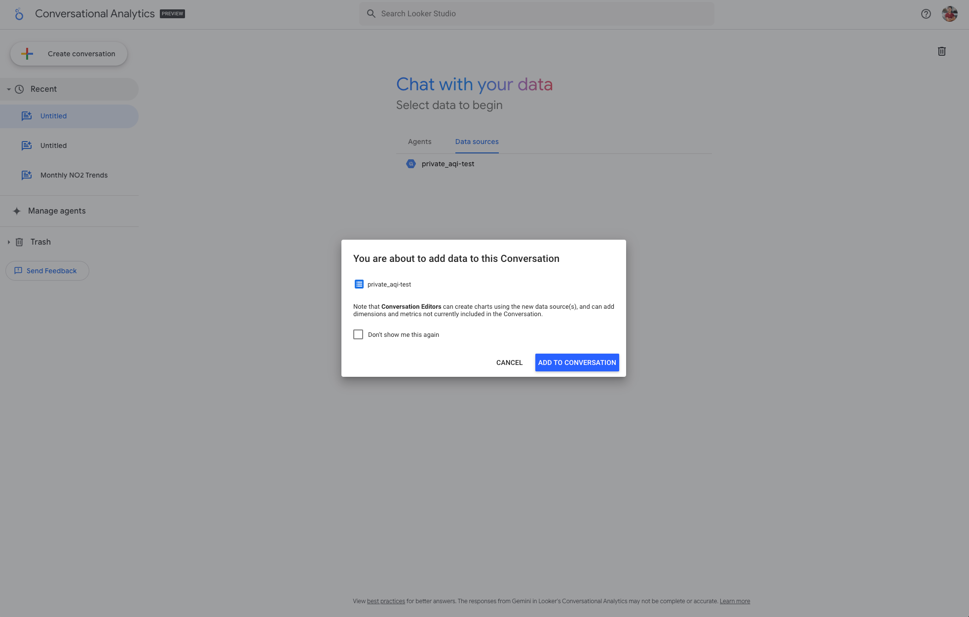
We uploaded the data directly into BigQuery because we already had a vacant instance. The process was seamless (albeit with a few hurdles, thanks to Google’s stringent IAM roles). CSV upload was also available and easy to use. Licensing was also straightforward - having the Looker Studio Pro license granted you access to everything you needed.

Once adding data to a conversation, we were able to add a description (which we’ll re-use if prompted by other systems) for the data, which then allowed the AI system to suggest relevant questions:

It then started with offering some ideas to explore, unprompted. These popped up after we added the dataset descriptor.
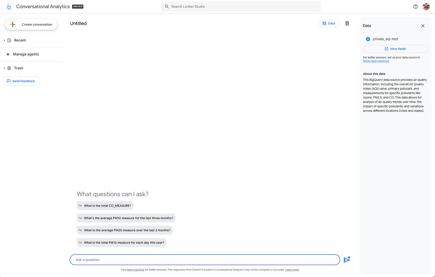
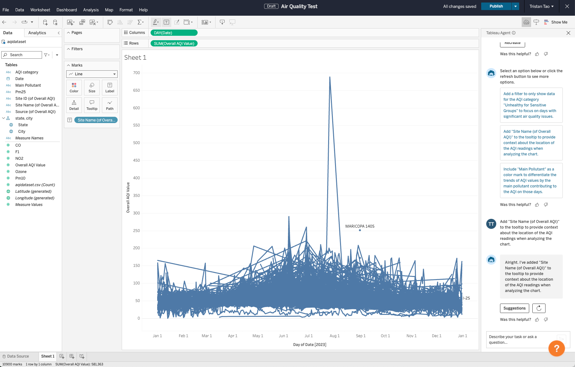
Sticking to our script, we asked, “I'd like to understand trends and other interesting insights about the Air Quality Data.” The question was followed by suggestions for better (and more insightful questions) such as: How has the overall AQI value changed over time?

The query generated an accurate chart using average(). Nice!
It clearly explained what was queried / how it arrived at the solution via the “How was this calculated” view attached to every query.
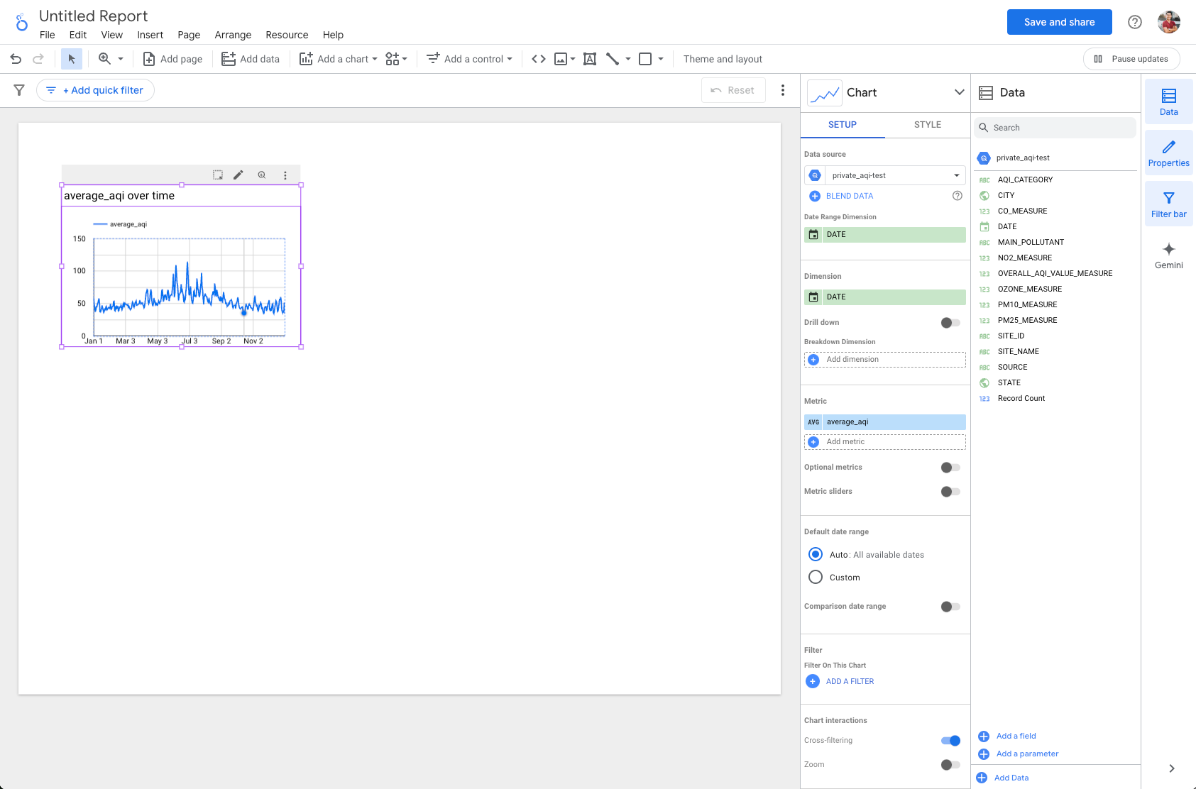
To further edit the query, it opens Looker Studio in a separate window, which leads to a report view with the current query embedded. This is a separate application that doesn’t appear connected to the conversation.

We asked another question drawing from one of its other suggestions: Are there regional differences in air quality within the dataset?


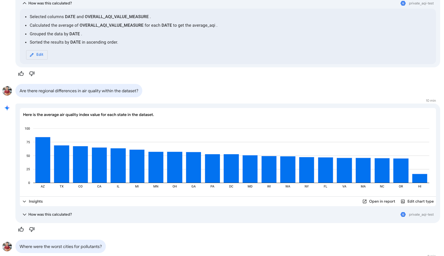
This generated a useful query which spawned some additional questions - what about specific cities? See the continued interaction screenshots below:


Pros:
“Suggested questions” were immensely helpful to get started once we added a descriptor for the data. In general, it did an amazing job prompting additional info to improve conciseness and suggesting next steps. It felt deliberately tuned to maximize conciseness.
Extremely clear explanations of queries and results.
The ability to jump into Looker Studio from the query was useful - you can engage Conversational Analytics to explore a piece of data and quickly turn it into a part of your existing BI assets.
Cons:
Limited editing capabilities in the conversational view, requiring users to switch to Looker Studio for a fuller query experience (while you can select a column in the “How was this calculated” view or change the chart type, you can’t change the aggregation). Unfortunately, it appears that the integration is mostly one-directional; you can turn a conversation into a query in a report, but once you do, it is no longer related to the conversation. This meant that additional changes in the conversation would only create entirely new queries unrelated to previous versions of the same exploration.
Struggled with retaining context in multi-step conversations. This is a critical flaw as the system actually does extremely well in asking clarifying questions.
Looker Conversational Analytics - General Impression:
Looker’s conversational BI is versatile. You can ask it to compute and generate many different visualizations. Unfortunately, it struggled to retain the context of the analysis, which defeats the purpose of conversational AI. While it felt resilient to hallucination because of its over-conciseness, it also removed a lot of value of “conversational analytics.” If I need to remind the AI what I mentioned 10 seconds ago, it effectively forces me to write fully structured complete questions - it’s almost faster to write the SQL at that point. There are many “explore data in natural language” products, and this felt like Google’s take on the product - ultimately, we wished it was more tightly integrated with Looker Studio.
Scores:
Flexibility: 5
The chat interface allows flexible interaction patterns. You can describe what you’re looking for, and the system guides you toward a more concise and actionable path of analysis.
Accuracy & Hallucination Resistance: 5
We were impressed by its ability to prompt for additional context / build a complete understanding of our intent before issuing a query. This is important because analytics is often open-ended. It also used the correct aggregation on the first try. When faced with an uncertain question, the system always prompted for clarification and re-referenced the original table.
AI Responsiveness: 5
Looker’s conversational analytics took only a few seconds for each response.
Ease of use: 2
The conversational UI is flexible, but to combat hallucinations (and retain accuracy), it repeatedly asked clarifying questions. Unfortunately, it seem to have forgotten my answer to the previous question (see step 6). The best approach is to type your full intent as a single complete response while minimizing ambiguity. This makes the conversation taxing because you’re forced to be overly verbose. The AI system also lacked a bidirectional integration with the underlying BI system in Looker.
Contextualization: 2
The conversational UI is great for exploration or quick slices, but the lack of deeper integration into Looker was disappointing. You can start an exploratory query in conversational BI, but once you fork the query to your dashboard, it is a separate object. You can’t edit the query in Looker Studio via Conversational Analytics nor can the AI system look at your existing queries and dashboards. Analytics often requires slicing the same data over multiple iterations, and the lack of meaningful integration between Conversational BI and Looker Studio makes for a poor experience.
Explainability: 5
There was never any ambiguity about what the tool was doing. The “How was this calculated?” dropdown breaks down every part of the query. It appeared that Google prioritized combating hallucination and providing transparency.
Player 2: Power BI (Pro)
Background:
Microsoft’s Power BI is a dominant player in the BI market. Known for its integrations within the Microsoft ecosystem, Power BI has grown significantly in adoption due to its user-friendly interface and robust feature set. We signed up to try their paid Pro license. While they have a co-pilot AI-assisted Q&A feature, it is gated behind another tier of even more premium licenses requiring SKUs wth higher Capacity Units (F64 or P1). For reference, F64 instances start at $8,409.60/month ($5,002.667/month when reserved) - this was, unfortunately, an unsurmountable paywall for this evaluation. That said, there is a separate Q&A for Business Users feature, which we evaluated.
Experience:
Signing up was seamless, requiring a work email.
Uploading the dataset was straightforward, though the CSV connector setup required some manual effort. This would’ve been seamless if we already had a Microsoft-oriented environment.

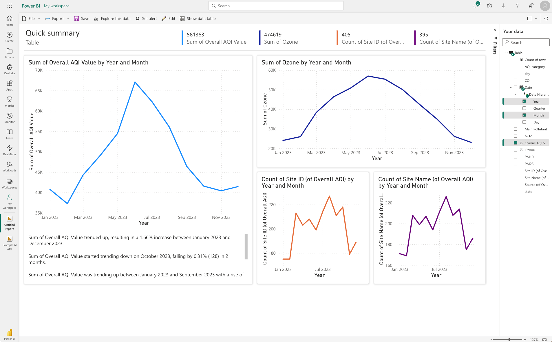
Power BI automatically generated a dashboard upon data upload, with no prompting needed. This was impressive! Unfortunately, many of the visualizations were non-sensical, which we elaborate further in the cons section.
We tried some of its dedicated AI features such as Insights which attempted to explain the discrepancies in some of the data points.

In order to try their Q&A For Business Users, we pin the Report to a Dashboard:

The initially pinned dashboard offers a Q&A interface, suggesting a few starting points. Nice!
Sticking to the script, we asked, “I'd like to understand trends and other interesting insights about the Air Quality Data.” Unfortunately, this returned a notice that it couldn’t understand the question. This doesn’t necessarily mean it’s not capable, as this is a broad and open-ended question. Instead, we tried one of the questions that Looker suggested: “How has the overall AQI value changed over time?” This produced the following result:

It’s unclear what it’s showing me - I’d guess sorted distinct dates. It doesn’t provide any measure to evaluate, nor did it result in a visualization.
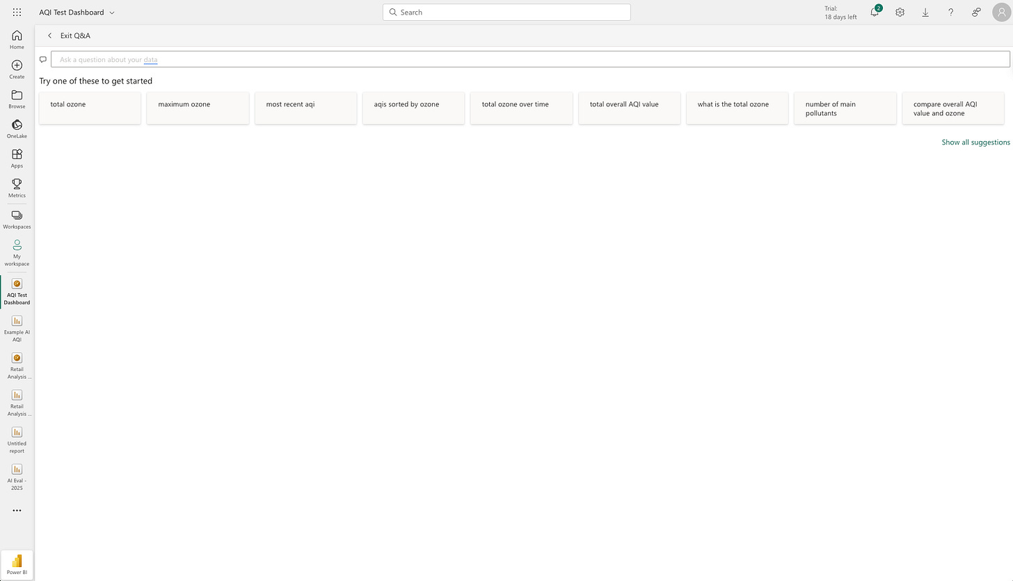
Now, let’s reset and try its suggested query in the Q&A. We tested the first 5 suggestions:


PowerBI's 5 suggested questions in the Q&A For Business Users. Query terms in order from the top left: "total ozone", "maximum ozone", "most recent aqi", "aqis sorted by ozone" (same result as the 1st query), "total ozone over time". Much better! We observed that the Q&A system did better with concise, keyword-driven inputs.
There is no way to interact based on the chart. This is a one-shot Q&A (in some capacity, a Search) with no follow-up ability. As far as we can tell, the feature is well-designed for finding
Next, we took a question we asked Tableau: “Where were the worst cities for pollutants?”

PowerBI highlights specific terms in the query, such as “worst.” Clicking the term reveals “We're not sure what you mean. Try another term, or add this one.”
The panel on the right shows the configuration details. In its current state, it shows the total sum of the various pollutants filtered by the 10 cities that produced the single highest max AQI value. As mentioned before, “summing” isn’t helpful, and it would’ve been nice for an AI system to address this issue quickly.


Pros:
Immediately created an entire dashboard as opposed to independent exploratory visualizations.
It caught some inconsistencies in “collection sites” where not all sites had the complete collection data via the “unique collection sites over time” view.
We tried their paid PowerBI Pro AI features - PowerBI has a robust set of use case-specific AI features like ‘Get Insights',’ ‘Detect Anomaly,’ ‘Explain Fluctuations, ’ and many more. We’re a fan of this use case-based approach that builds AI-specific workflows into the BI tool because it allows them to implement best-in-class models for each use case, which should yield better results.

PowerBI "Insights (Preview)" The Q&A for Business Users feature is excellent for one-shot use cases where you need to quickly pull up a single metric.


Cons:
It didn’t ask for my input before generating the report. The automatically generated dashboard lacked relevance, focusing on summing metrics like ozone levels, which didn’t make logical sense. There was no AI assistance to progress further.
PowerBI lacked a clear place to introduce context about the data, use case, and additional questions. Some of this setup may be hidden behind their Copilot Q&A, which we couldn’t test under the Pro license due to cost limitations.
Their Copilot Q&A system required more setup than others. All other vendors allow you to upload a dataset to start, whereas Microsoft requires us to navigate their SKUs to turn it on.
PowerBI (Pro) General Impressions:
Power BI is impressive upon initial setup due to its immediate dashboard creation but falters in delivering insightful AI-driven analysis out of the box. We’re a fan of their implementation of use case specific AI approach, which doesn’t blindly rely on LLMs. That said, we wished that it offered more flexibility in taking instructions and contexts which would’ve greatly improved its results. Q&A for Business Users introduced some of this functionality, but it lacked flexibility in empowering users to explore 2nd and 3rd-order questions. Lastly, PowerBI could benefit from some consolidation of its AI suites (we could only test features under their Artificial Intelligence section of the doc) and SKUs, as it was the only vendor where the initial (fabric) capacity requirement felt like a legitimate overhead.
Power BI (Pro) Scores:
Flexibility: 3*
While it comes with some prebuilt AI offerings, the lack of directional input reduces the tool's flexibility. The Q&A feature enables business person to ask a question that they might be able to glean from a dashboard/report, but did not enable them to get answers for 2nd and 3rd order questions. *We add an asterisk because we suspect that CoPilot Q&A (not to be confused with the Q&A for Business Users we tested) could improve this score meaningfully.
Accuracy & Hallucination Resistance: 2
Unfortunately, summing up AQI values doesn’t make sense. While the dashboard was visually coherent, the underlying analysis was mostly useless. There was no easy way of remediating this except manually editing each query in the dashboard. Their “Explain” feature did yield slightly better results. An analyst can still reconfigure the correct view, but the objective of the evaluation was to see how AI can help expedite the process. PowerBI was the only vendor that couldn’t produce insight in the confines of “only using AI.”
AI Responsiveness: 5
Everything felt responsive, except for the initial load, where it took north of 20 seconds.
Ease of Use: 3
Because each AI interaction is tucked behind a bespoke button, there’s a lot of documentation to be consumed and followed. This made it more difficult and timely to leverage the tool.
Contextualization: 1
PowerBI was the only vendor that didn’t prompt to learn more about the data. It explains why the analysis yielded non-sensical results (like sum of AQI values). Unfortunately, the mistake was costly - you’d have to manually edit all 8 queries in the generated dashboard. This feels like something an AI would excel at.
Explainability: 3
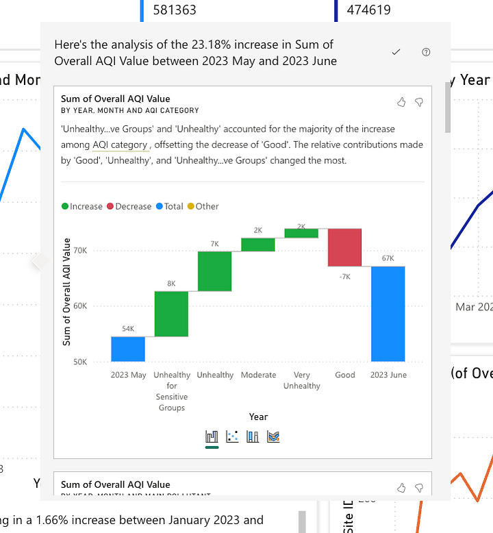
While the generated dashboard was self-explanatory in terms of the individual queries, we would’ve loved to see some explanation of what it did, and why. Unfortunately, their dedicated AI features were more challenging to decipher. Take a look at the 23.18% increase explanation in “PowerBI Insights (Preview)" in the pros section and note how difficult it is to follow the x-axis. More context would’ve been helpful.
Player 3: Tableau Agent (formerly Einstein CoPilot)
Background:
Tableau, acquired by Salesforce in 2019, is another dominant player in the BI space. Its Tableau Agent, rebranded from Einstein CoPilot in late 2024, represents Salesforce’s push into AI-driven analytics. Tableau also has multiple AI-oriented offerings, including Pulse. In this evaluation, we focused on Agent, given its newest rebrand. We tested Pulse but felt that Agent provided an experience better fit for this evaluation.
Experience:
Data upload was a breeze, but the configuration to enable the AI system was tucked away in an obscure configuration page (no extra SKU required, however). Once enabled, a nice little drop-down nudges you to try it within Tableau Cloud.-


Tableau CoPilot Initial Set Up I asked the same starting question: “I'd like to understand trends and other interesting insights about the Air Quality Data.” It created a simple visualization summing up all of the air quality data. Unfortunately, the summed values aren’t helpful, which was the same issue as PowerBI. This was a quick fix - we simply prompted the AI to use average.


Initial Exploration by Tableau Agent. Unassisted on the left, corrected by prompting on the right. We noticed that it could “suggest analysis,” which led to 3 suggestions, each being a single click to execute (nice!). We tried each path independently and found 2 of the charts to be incoherent (one included as an example), while the other was more insightful (albeit still erroneous given that it was still summing).

Tooltip added by Einstein Agent. We continued by asking the same question we asked Looker Conversational Analytics: “Are there regional differences in air quality within the dataset?” This led to an insightful geo-map chart that showed 5 distinct pollutants geographically. We have to note that this is by far the most visually appealing chart that any AI system has helped create thus far. Well done, Tableau!

We then asked, “Where were the worst cities for pollutants?” which led to a bar chart sorted by the max(overall AQI). Looker sorted by the average(overall AQI), which is closer to what I had in mind, but this falls within the interpretation margin of error, so both are valid.
Next, we asked, “Can we use the average over the entire year?” and it quickly updated the query and generated precisely what we initially expected.

Because it was performing so well, we decided to throw it a curve ball: How does pollution differ between coastal states vs. landlocked states?” It appears that the model is locked to focus on interacting with Tableau itself and lacks contextual knowledge of a generalized LLM.


Pros:
One-click execution by the AI in the actual BI for suggested analyses is incredibly powerful.
Incorrect initial attempt at querying the data, but recovered quickly when prompted. We consider this a pro - it’s expected that AI makes mistakes; it’s more important that it quickly fixes the query based on feedback.
The BI and Agent integration is best among the three we’ve tested so far. It actually feels like an agent is executing a task on your behalf. This is especially true as it offered to “add a tooltip” to the chart to help with explainability - it’s not confined to just “generating queries.” This is an overlooked feature as it dramatically increases your analytical velocity - every analyst knows that the query is just the beginning; to build an insightful report, you need interactions, tooltips, colors, titles, and many other configurations.
Cons:
The Tableau Agent felt like it was designed entirely for the analyst. If you’re unfamiliar with the Tableau query-building experience (perhaps as a business user), you might be flustered. Our belief is that Pulse is more oriented for the business users, once it is properly configured.
Lacks “Agent” integration with dashboards - it’s currently limited to worksheets - I’m sure they’re working on it ;)
There’s less “explaining” of what it’s doing, and instead, it just does it. This is a double-edged sword. For example, it offered to add a tooltip to better explain the query. When we executed the suggestion, it created an incoherent chart. If you’re a tableau expert, you may know what it’s doing, but it requires us to undo and investigate. The one-click execution is fantastic but can lead to confusion. While errors are expected, a clearer explanation of its actions in greater detail would help with debugging.
It had a bit of trouble with more complex instructions. As a fun bonus, we asked, “Of the 3 most polluted cities, which state had the single highest recording for pollutants? What about the lowest?” It responded with 3 cities we haven’t seen before: “St. Louis Park City Hall”, “BELLEVUE STATE PARK”, and “FIELD IN SE PORTION OF PARK” (we are equally curious about what special pollutants these specific locations hold), despite this information being present in the visualization of the current view (LA, Phoenix, Houston). See the interaction screenshot. We weren’t trying to trick it - we wanted it to see what we were literally staring at on the screen, together.

This inability to leverage the analysis results is a key limitation. This is problematic because the very ethos of analytics requires you to look at your current query results, ideate, and iterate. We suspect this was a choice Tableau made, perhaps for compliance reasons.
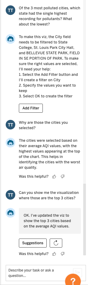
Tableau General Thoughts:
Tableau is a potent BI platform. There is a reason why they were acquired for $15.7B by Salesforce in 2019. The integration between the AI agent and the tool feels well-designed. Where the agent messed up, the dedicated Tableau UI allows you to undo-redo quickly. This offers the perfect level of flexibility and interaction pattern for an analyst. While the Agent hallucinated several cities that did not exist in the data, the overall experience was excellent. The biggest issue was its inability to understand the results of your query, which is pivotal given the iterative nature of analytics.
Tableau Agent Scores:
Flexibility: 5
The chat interface allows you to naturally converse.
Accuracy & Hallucination Resistance: 3
While the initial visualization was incorrect, it quickly recovered after being prompted. Unfortunately, it did hallucinate several “cities” when asking to filter despite those cities being present on the very same view on the screen. This was the only real hallucination we observed out of all 4 evaluated vendors.
AI Responsiveness: 5
The AI system was speedy, and the “one-click execute” functionality makes this a solid 5.
Ease of Use: 5
It genuinely felt like an agent who could execute my tasks natively within the platform. It was reminiscent of Pair Programming in software engineering, where the agent acts as the driver, and you’re the navigator. It knows how to generate the queries and institute configuration changes in the visualization with a single click. Very impressive.
Contextualization: 2
This was the weakest part of the Tableau Agent. It doesn’t appear that the Agent could interpret the charts/resulting data. This is a critical part of working with AI in analytics because “query -> interpret results -> query again based on interpretation” is a core part of the analytics flow.
Explainability: 3
While the agent tried to explain what it was doing, the one-click-execute didn’t elaborate enough about what it was doing. The undo/redo allowed us to spot the delta, but it was rather manual.
Player 4: HyperArc
Background on Memory:
HyperArc was founded 3 years ago to pioneer the next generation of Business Intelligence. We felt that modern BI was becoming stagnant, with most vendors offering the same old features: dashboards, reports, queries, database connections, etc. As a team of industry veterans in BI and Data, we knew that “a slightly better dashboard” wouldn’t move the needle - a paradigm shift was required. We saw the rise of LLMs and numerous companies investing in generic text-to-SQL tech but felt that it was missing a key element of how analysts actually analyzed data; the idea of Memory. Memory is what your analysts learn about your data. It grows and compounds as they query, explore, and discover insights. It’s actually what makes your great analysts great. It is unique to your business and your data. Your new analyst, John, may be just as proficient in SQL/BI as your current one, Anne - but who will you call first when you have a question? Without a doubt, Anne. That’s because of Memory.
Memory is a key concept at HyperArc: you can learn about HyperArc Memory here.
The future of BI is exciting. AI and Agents are already shifting the foundation of modern Software and BI. But that Agent needs to be getting smarter, not just in general know-how, but also learning the nuances of your business and data. The former will likely be solved by OpenAI and other foundation models. The latter, hopefully, by us.
Experience:
Data upload is a breeze (as is integrating with your data warehouse). Once uploaded, our AI system prompts you to provide descriptors and human-readable labels for the columns. This is entirely optional but aids in adding context to your data. We click on Prep, which uses an AI system to guess both values. For the evaluation, we leave the descriptors and names just as the AI suggested, with no manual intervention.
![prep_demo.gif [resize output image]](https://substackcdn.com/image/fetch/$s_!HkLl!,w_1456,c_limit,f_auto,q_auto:good,fl_lossy/https%3A%2F%2Fsubstack-post-media.s3.amazonaws.com%2Fpublic%2Fimages%2Fa68e16a7-ffb1-4473-b2d2-953e3e99c30d_1074x591.gif "prep_demo.gif [resize output image]")
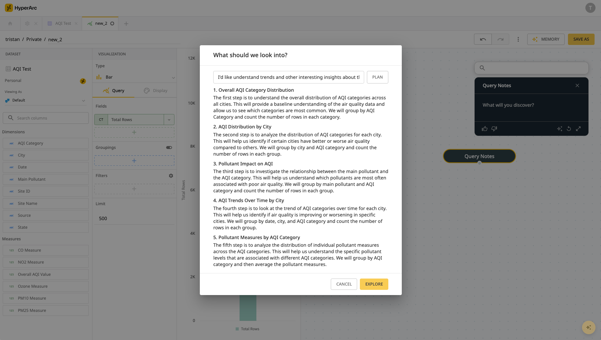
We open the query interface and leverage our HyperGraph AI to ask the same question: “I'd like to understand trends and other interesting insights about the Air Quality Data.” This generates a query plan that the user can preview before executing.

Click Explore, and it executes all analyses mentioned in the plan. This step is a bit time-consuming (1-2min to plan test); this generates a full HyperGraph below, which we’ll explore in greater detail.

The generated HyperGraph from the initial query The first node adds new measures that our AI system believes might be relevant:
Row count
Average of PM2.5 measurement
Standard deviation of the overall AQI Score
A custom composite score that is an average of measurement across the 5 pollutants
![prep_demo.gif [resize output image]](https://substackcdn.com/image/fetch/$s_!HkLl!,f_auto,q_auto:good,fl_progressive:steep/https%3A%2F%2Fsubstack-post-media.s3.amazonaws.com%2Fpublic%2Fimages%2Fa68e16a7-ffb1-4473-b2d2-953e3e99c30d_1074x591.gif "prep_demo.gif [resize output image]")

Now let’s explore a few of the nodes that it autonomously generated through the query plan:
![aiq_hypergraph_nodes.gif [resize output image]](https://substackcdn.com/image/fetch/$s_!E3Kp!,w_1456,c_limit,f_auto,q_auto:good,fl_lossy/https%3A%2F%2Fsubstack-post-media.s3.amazonaws.com%2Fpublic%2Fimages%2Fec8fbc6f-1049-4e85-b176-653d09653686_1100x572.gif "aiq_hypergraph_nodes.gif [resize output image]")
Every “auto-explored” node comes with a null hypothesis, its evaluation, additional info it observed, and notable data points. This is a key part of what an analyst does - develop a theory, look at the data, learn what’s relevant, and iterate. The exploration not only creates visitable query steps but also generates valuable Memory about your business at each specific step of the exploration.
In the final consolidated nodes, the AI suggests exploring additional paths, such as comparing specific chosen days and cities based on previous observations - e.g., California having the highest pollutants and Hawaii having the lowest.
![Jan-06-2025 16-09-23.gif [resize output image]](https://substackcdn.com/image/fetch/$s_!o0tH!,w_1456,c_limit,f_auto,q_auto:good,fl_lossy/https%3A%2F%2Fsubstack-post-media.s3.amazonaws.com%2Fpublic%2Fimages%2Fae597505-9dc2-4355-9c1e-708dc4a7c519_1320x686.gif "Jan-06-2025 16-09-23.gif [resize output image]")
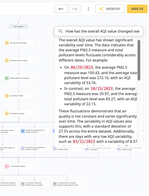
HyperGraph Suggested Next Steps But what if I had a specific question? Let’s throw in one of the suggested questions from Looker Conversational Analytics: “How has the overall AQI value changed over time?”.
The Local Q&A feature allows you to ask the question based on all of the memories that it has thus generated in this particular query, along with a few notable points like the highest days:

Local Q&A allows you to search through the entire history of this exploration path for both AI and user-generated queries. Underneath the written explanation, it cites the Memory where it discovered those insights so that you can verify its claim and extend the query as needed. To keep things fair, we won’t make any manual edits. If you do happen to manually edit the query, however, it would generate a new node (with associated Memory) that you can extend and/or revisit. This is our way of fostering AI <> user collaboration.
![Jan-06-2025 16-18-19.gif [resize output image]](https://substackcdn.com/image/fetch/$s_!IkoW!,w_1456,c_limit,f_auto,q_auto:good,fl_lossy/https%3A%2F%2Fsubstack-post-media.s3.amazonaws.com%2Fpublic%2Fimages%2F0fe90dac-8211-454b-9305-63dc8fef02df_1100x572.gif "Jan-06-2025 16-18-19.gif [resize output image]")
Navigating the HyperGraph
Next, let’s ask a few questions that the other systems struggled with. To do so, we’ll save this particular query and HyperGraph. We’ll leverage our Global Q&A, which allows you to talk to an arbitrary number of existing queries, dashboards, and their HyperGraphs. In this evaluation, only the single previous query and its auto-generated HyperGraph are included.
It pulls up the relevant memories it discovers, summarizes what it found, and notes that “it's not possible to definitively identify the 'worst' cities for pollutants.” No hallucinations here ;)

This means we need to generate a new query (and new memories) - click Continue Exploration, and it will automatically do so.
![Jan-06-2025 16-40-53.gif [resize output image]](https://substackcdn.com/image/fetch/$s_!W3mJ!,w_1456,c_limit,f_auto,q_auto:good,fl_lossy/https%3A%2F%2Fsubstack-post-media.s3.amazonaws.com%2Fpublic%2Fimages%2Fa68e84f8-0c88-459e-aa60-19fd85000b98_1100x572.gif "Jan-06-2025 16-40-53.gif [resize output image]")
When Global Q&A can’t find an answer, it generates a query and starts an exploration. This way you know if it’s searching through your existing memories v.s. generating new ones.
To wrap, let’s try the question that tripped up Tableau: “How does pollution differ between coastal states vs. landlocked states?” Our AI system broadly understands landlocked states and provides you a written summary. Clicking the Continue Exploration yields the actual query, with a SQL expression representing Landlocked v.s. Coastal.
![landlocked.gif [resize output image]](https://substackcdn.com/image/fetch/$s_!wezY!,w_1456,c_limit,f_auto,q_auto:good,fl_lossy/https%3A%2F%2Fsubstack-post-media.s3.amazonaws.com%2Fpublic%2Fimages%2Fa8cefcb4-1a95-46d7-9e16-7f188f603073_1100x572.gif "landlocked.gif [resize output image]")
This report is getting long enough, so we’ll pause here. But we’ll take this opportunity to highlight some of the features that don’t want to regurgitate; take a look at our BI for Cursor post to learn more.
![aiq_hypergraph_nodes.gif [resize output image]](https://substackcdn.com/image/fetch/$s_!E3Kp!,f_auto,q_auto:good,fl_progressive:steep/https%3A%2F%2Fsubstack-post-media.s3.amazonaws.com%2Fpublic%2Fimages%2Fec8fbc6f-1049-4e85-b176-653d09653686_1100x572.gif "aiq_hypergraph_nodes.gif [resize output image]")
![Jan-06-2025 16-09-23.gif [resize output image]](https://substackcdn.com/image/fetch/$s_!o0tH!,f_auto,q_auto:good,fl_progressive:steep/https%3A%2F%2Fsubstack-post-media.s3.amazonaws.com%2Fpublic%2Fimages%2Fae597505-9dc2-4355-9c1e-708dc4a7c519_1320x686.gif "Jan-06-2025 16-09-23.gif [resize output image]")
![Jan-06-2025 16-18-19.gif [resize output image]](https://substackcdn.com/image/fetch/$s_!IkoW!,f_auto,q_auto:good,fl_progressive:steep/https%3A%2F%2Fsubstack-post-media.s3.amazonaws.com%2Fpublic%2Fimages%2F0fe90dac-8211-454b-9305-63dc8fef02df_1100x572.gif "Jan-06-2025 16-18-19.gif [resize output image]")

![Jan-06-2025 16-40-53.gif [resize output image]](https://substackcdn.com/image/fetch/$s_!W3mJ!,f_auto,q_auto:good,fl_progressive:steep/https%3A%2F%2Fsubstack-post-media.s3.amazonaws.com%2Fpublic%2Fimages%2Fa68e84f8-0c88-459e-aa60-19fd85000b98_1100x572.gif "Jan-06-2025 16-40-53.gif [resize output image]")
![landlocked.gif [resize output image]](https://substackcdn.com/image/fetch/$s_!wezY!,f_auto,q_auto:good,fl_progressive:steep/https%3A%2F%2Fsubstack-post-media.s3.amazonaws.com%2Fpublic%2Fimages%2Fa8cefcb4-1a95-46d7-9e16-7f188f603073_1100x572.gif "landlocked.gif [resize output image]")
HyperArc Closing Thoughts:
Given that we’re the author, it’s challenging to give pros/cons for ourselves - typically speaking, you wouldn’t build features that you don’t like (subscribe to the blog for more of these free MBA tips). Instead, we tried to be more diligent in describing how our platform behaves, and we’ll let you be the judge. What we want to emphasize is the importance of Memory. Not just any memory but specific ones about your business and your data. In just 10 minutes, we’ve taught our HyperGraph agent about Air Quality via generated Memory, and it will now understand how to deal with similar datasets. In addition, you can always revisit every piece of insight automatically captured via Global/Local Q&A.
As your analyst uses the tool, our AI learns about your business and how your analysts operate. This creates a cycle that powers a super agent who excels at analyzing your data, specifically.
P.S. It’s important to note that we do not mix customer memories and queries. Your data and queries will always only be used to help supercharge your organization.
HyperArc Scores:
Flexibility: 4
While we allow you to suggest any desired next steps in natural language via Extend and Global Q&A, we realize that a lack of a singular cohesive chat interface (with a history of the conversation) results in a lost point.
Accuracy & Hallucination Resistance: 4
Our results are grounded in truth because every analysis is always linked to a verifiable query. All AI-selected fields, aggregations, and filters made sense in the evaluation. We believe verifiable queries (run by a deterministic query engine/data warehouse) always yield the most accurate results. We didn’t encounter any hallucination in this evaluation, but given how anti-hallucination Looker’s Conversational Analytics felt, we didn’t feel we deserved a 5 here.
AI Responsiveness: 2
The biggest drawback of our agent-based auto-exploration is time to completion. While our core modern BI platform is nimble (as is Extend and local/global Q&A seen in the gifs), our full AI planned and executed auto-exploration does require a heavy AI workload, resulting in 1-2 minutes for planning and executing.
PS If you’re an executive at any of the foundation models (OpenAI, Gemini, Anthropic), we’d love to chat ;)
Ease of Use: 4
HyperArc offers natural language query (NLQ) and dedicated UX interaction patterns for AI. You can leverage NLQ to create a specific next step or describe a general exploration. That said, clicking a button is sometimes more convenient (Global Q&A → dedicated query interface). But knowing what we have in our near-term roadmap, we can’t give ourselves a 5 yet.
Contextualization: 5
This is what HyperArc is built for - contextualization via Memory. We believe that building a repository of Memory allows an organization to build an edge in its analytics practice. Most companies are eager to hire great analysts. But with an average tenure of 2.6 years, what happens when they leave? By collecting Memories about how your best analysts conduct analysis and their resulting insights, we are building an AI system that remembers more context about your business than anyone else.
Explainability: 5
All AI-generated insights are always 1 click away from an underlying query/query result that can be quickly viewed. Our Q&A cites its source in Memories and Queries (a concept we borrowed from Anthropic). Based on our customer interviews, this was a priority. While AI continues to improve in accuracy, explainability remains a priority.
In Summary:
The rule was simple. Upload the data, ask some questions, click some buttons, only allow the AI to be the driver, and see what happens. Yet this simple flow produced materially different experiences for each industry titan.
It’s easy for us to sit back in our chairs and criticize others - but it’s unsurprising that none of the AI + BI systems was perfect. What was electrifying was the divergence in how these companies are building AI into BI. Most would agree that modern BI has become commoditized—under the hood, it’s all the same: modeling, metrics layers, queries, dashboards, reports, and so on. What excites us is how AI is shattering this monotony, forcing companies to break free from the status quo and embrace bold, imaginative features. Looking at you, Power BI—Mr. Instant Dashboard! In that same vein, we firmly believe that we’re at the tip of the spear in this new movement.
Lastly, I want to re-emphasize that this isn’t a professional, comprehensive report like the ones that Gartner and Forrester produce. I’ve personally worked with both companies in my past life, and their spreadsheets of scoring criteria are impressive—my coffee consumption during that period may have singlehandedly propped up Starbucks’s market cap. Instead, we tried to be honest, fair, and led with genuine curiosity. We hope you enjoyed it.
Follow us on this blog or shoot us a note at hello@hyperarc.com!
P.S.
We’re partnering with paid guest authors! Shoot us a note at the same address if you’re interested in trying HyperArc and writing about your experience and discovery!